Background
Design was always a crucial element in building Project Jetson, UNHCR’s project for predicting the movement of displaced populations in Somalia. As the team ventured into new areas of work that were seemingly complex and technical they wanted to provide an accessible interface for their audiences.
The Innovation Service wanted to move away from the traditional mindset where design is viewed as an afterthought and ‘making things pretty’ and shift to partnering with someone who understood design as a methodology to create change. The team looked for people who understood everything from the context of forced migration, design, artificial intelligence, and user experiences to engagement for online spaces.
Lauren Parater, the team’s lead for strategic communications discovered me in 2016 after watching a TEDx talk I did on predicting population movement in Africa. After realizing the creative synergies between the Innovation Service and my expertise, I was recruited to begin supporting UNHCR’s experimental Jetson project.
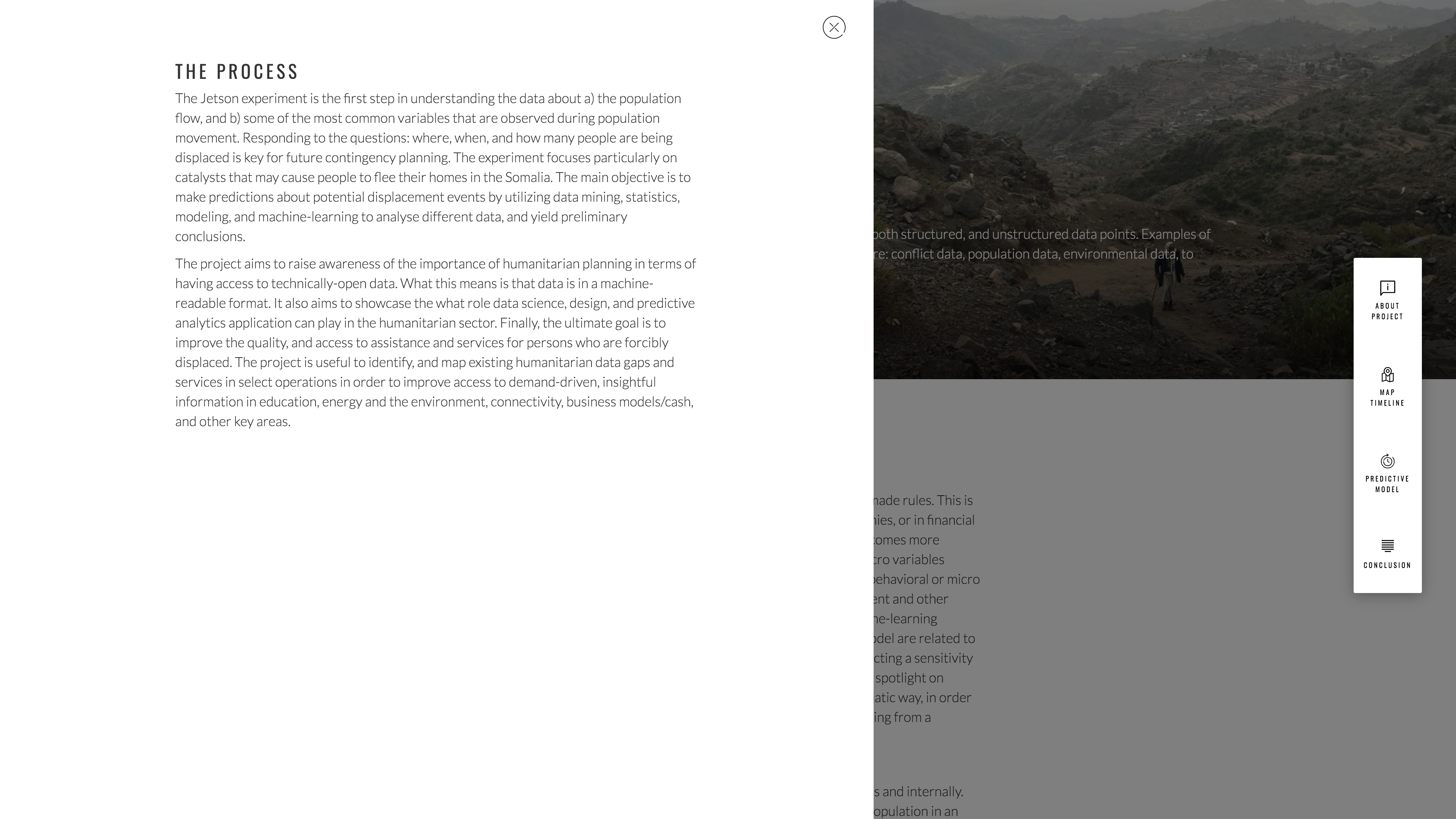
The Process
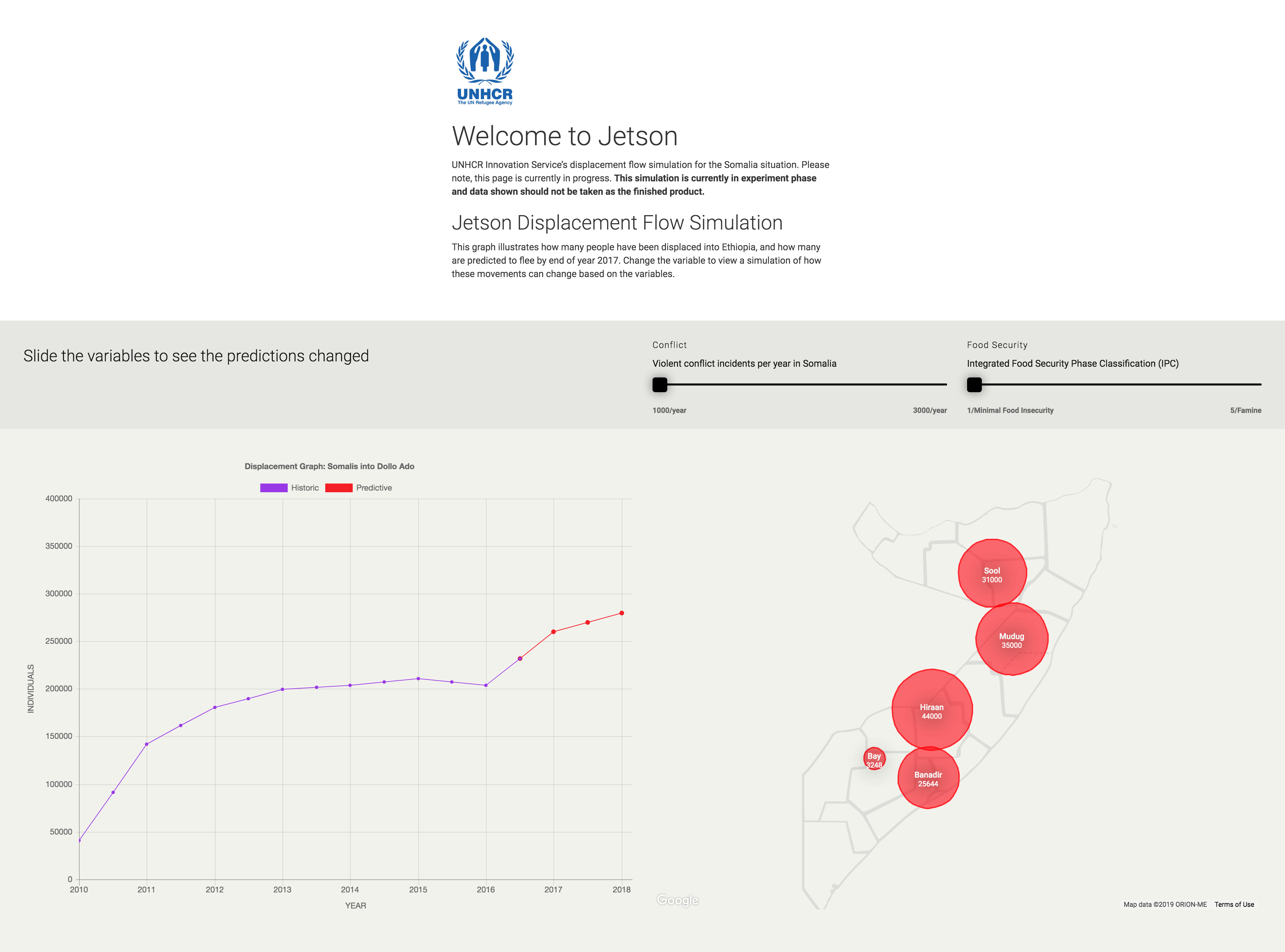
The first version of the Jetson website included an interactive map visualisation that allowed users to see the effects of environmental variables (conflict and food security) on displacement figures.
Jetson Version 1.0.0
Later iterations integrated the Jetson engine into the website with interactive elements to demonstrate the effects of weighted variables on displacement predictions in respective Somali operations/areas. This, unfortunately, slowed the experience down drastically as the predictive engine required significant amounts of computational power to run.
Jetson Version 2.0.0
Jetson Version 2.0.0
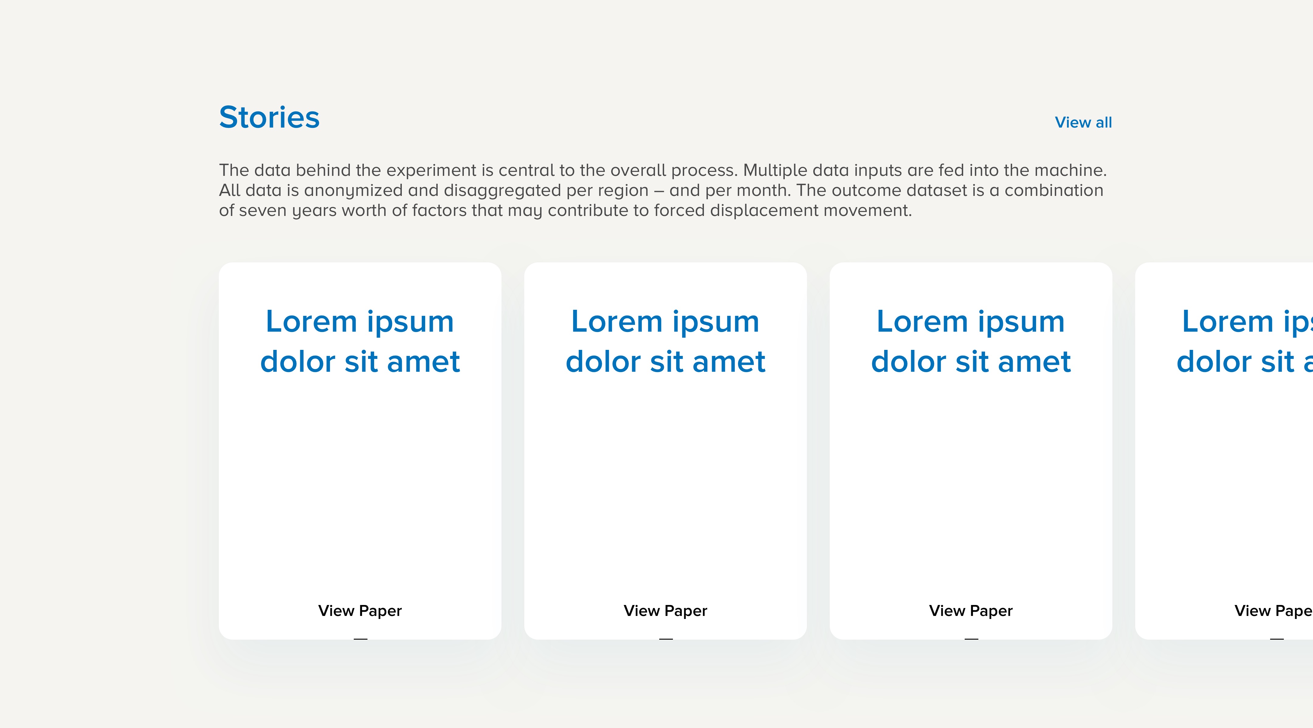
We then moved towards data storytelling and focused on telling the story of our historic statistics.
Jetson Version 3.0.0
We built a map visualisation that captured the movement of people between 2010 and 2017, overlaying this with a heatmap of monthly recorded conflicts. This was successful from a story-telling perspective and was the first time the Jetson team applied storytelling to describe our work through visual tools.
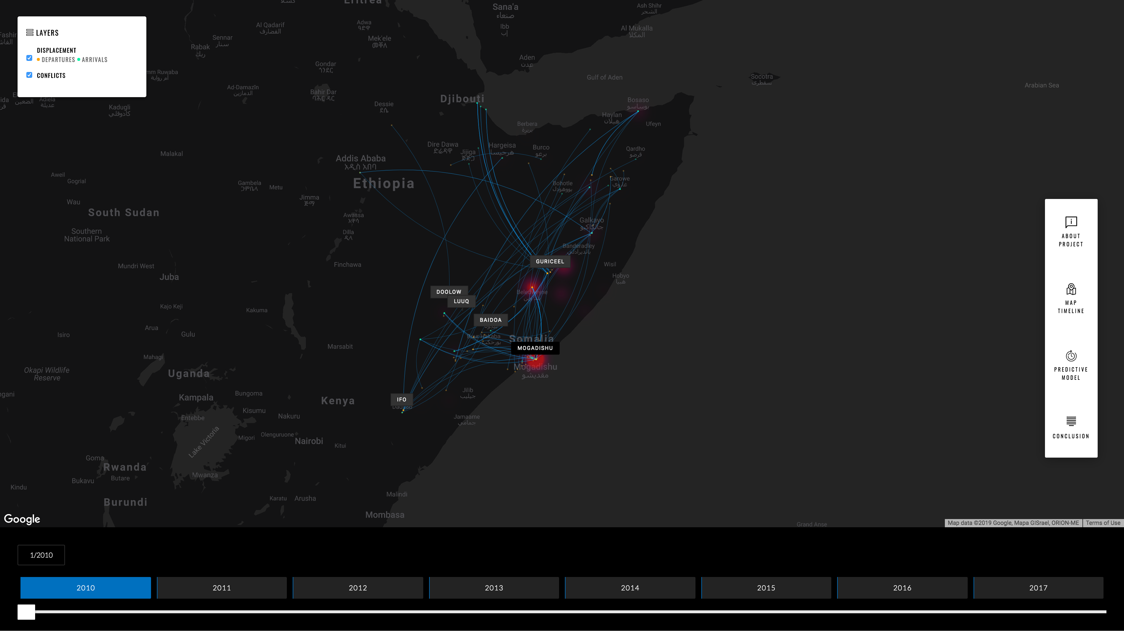
Jetson Version 3.0.0
Jetson Version 3.0.0
However, one downside it presented was its weight on the browser and how this compromised the experience for users with low or poor connectivity. We attempted to assuage this by creating a second “lite” version of the site with heavily optimised graphics and more options to display data-heavy elements such as the map visualisation.
Jetson Version 3.0.0 – Lite
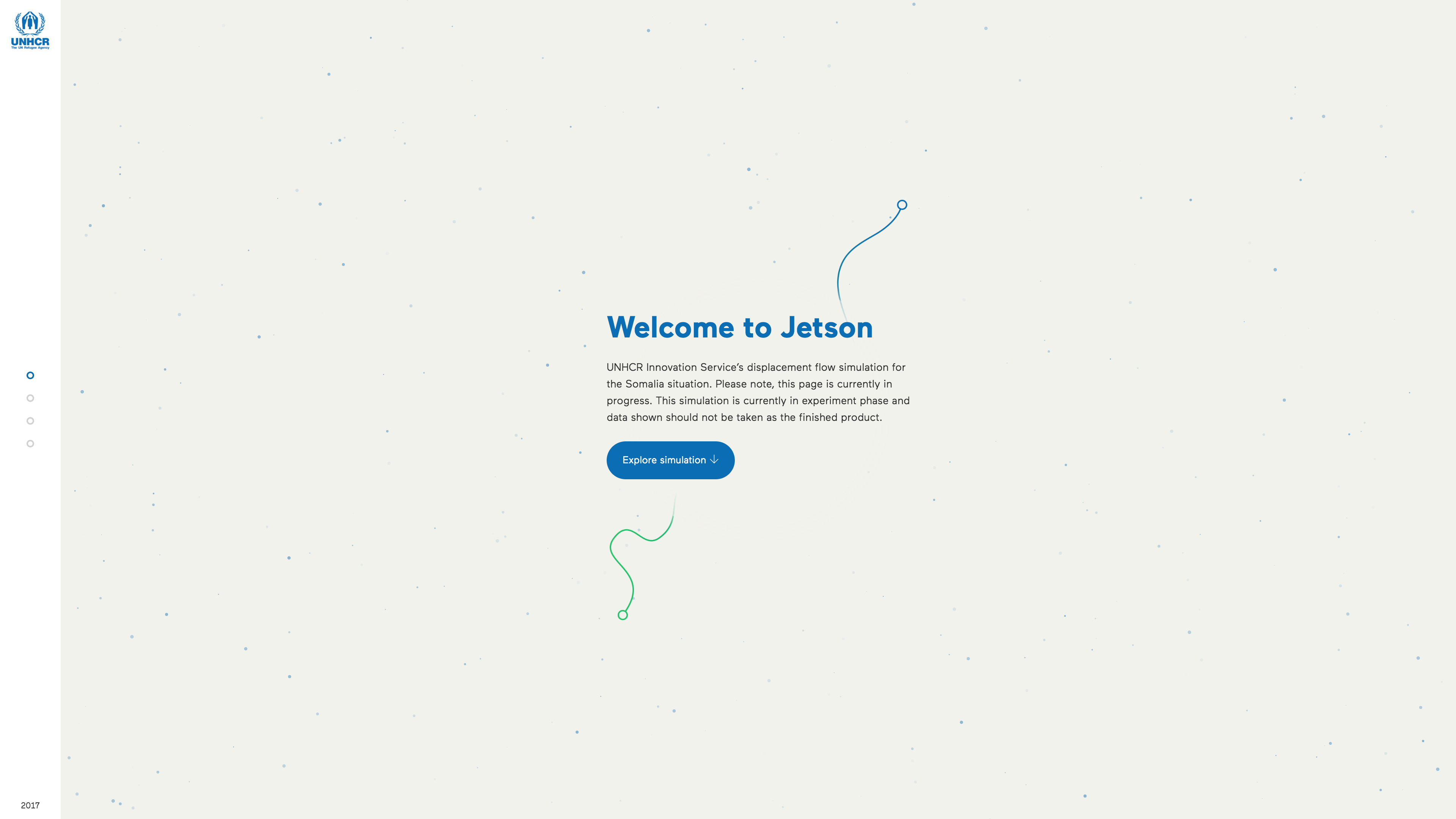
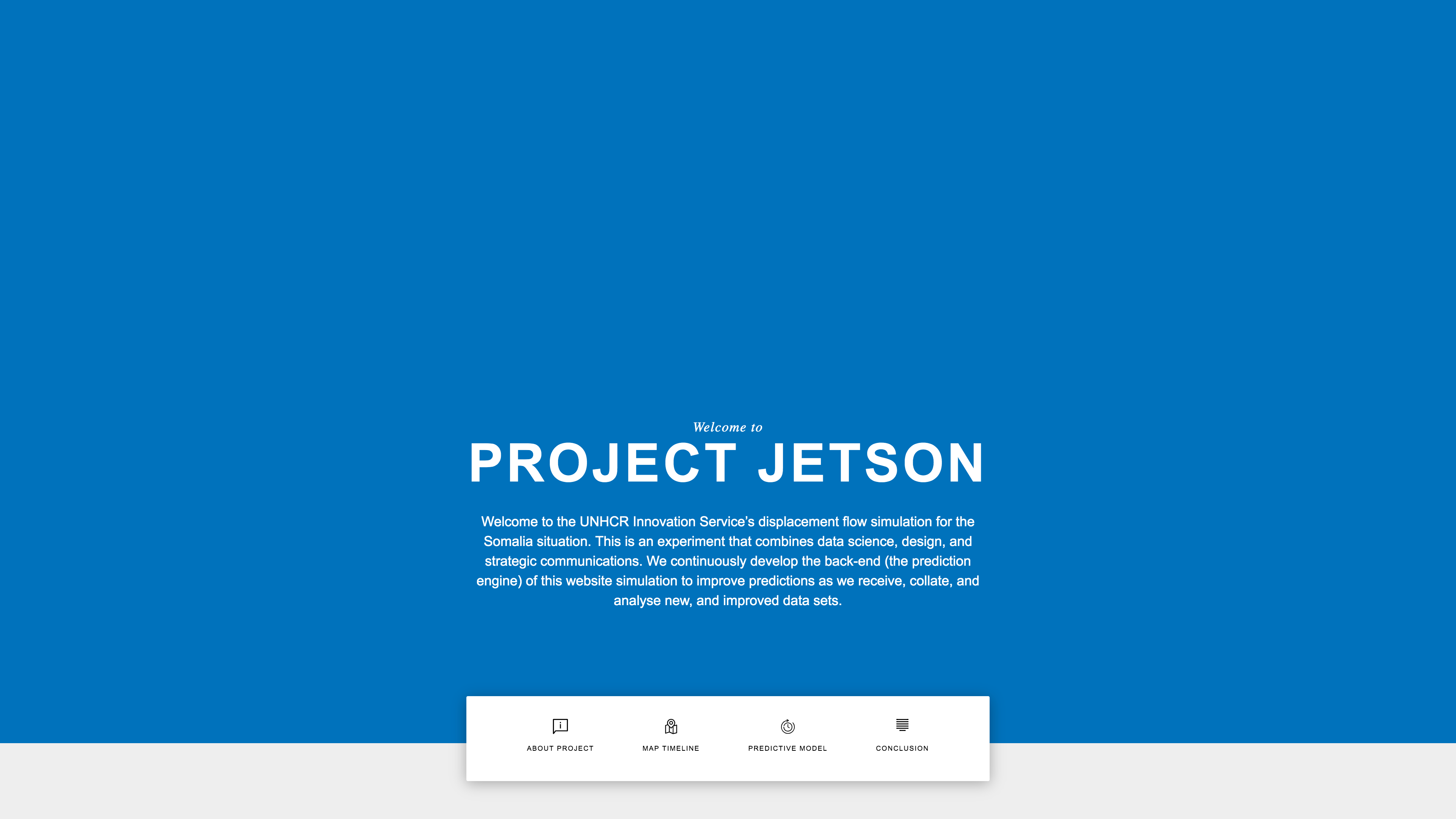
After noticing success in the reception of the low-bandwidth “lite” website version we agreed to make the base experience one optimised for speed and accessibility.
With visualisations no longer at the fore, we decided to focus on telling a compelling story around the project and the process of innovation behind its successes and failures.
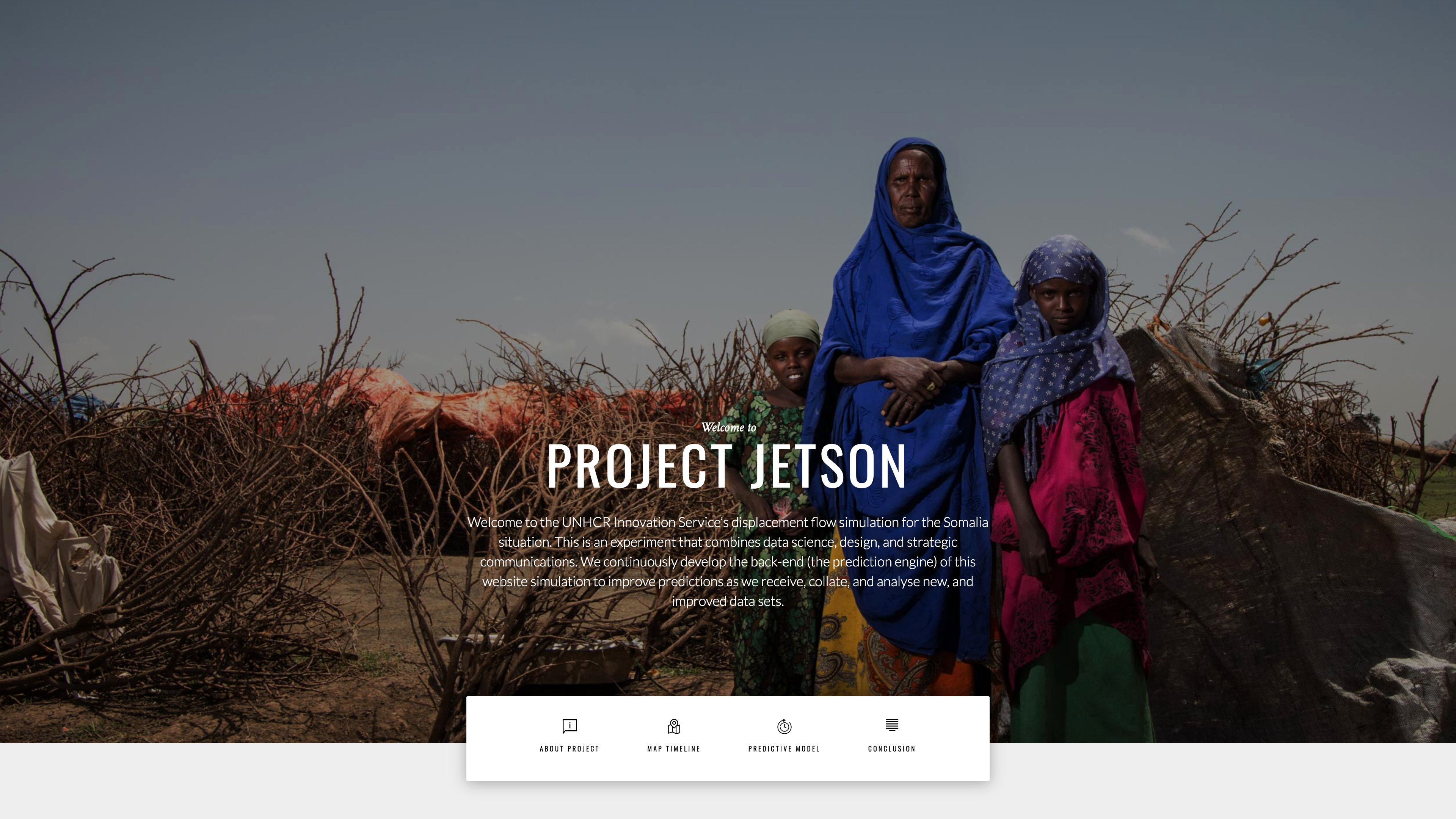
Jetson Version 4.0.0
The result was a fast-loading website that still retained the more computationally intensive elements of its predecessors albeit with an opt-in bottle neck.
Jetson Version 4.0.0
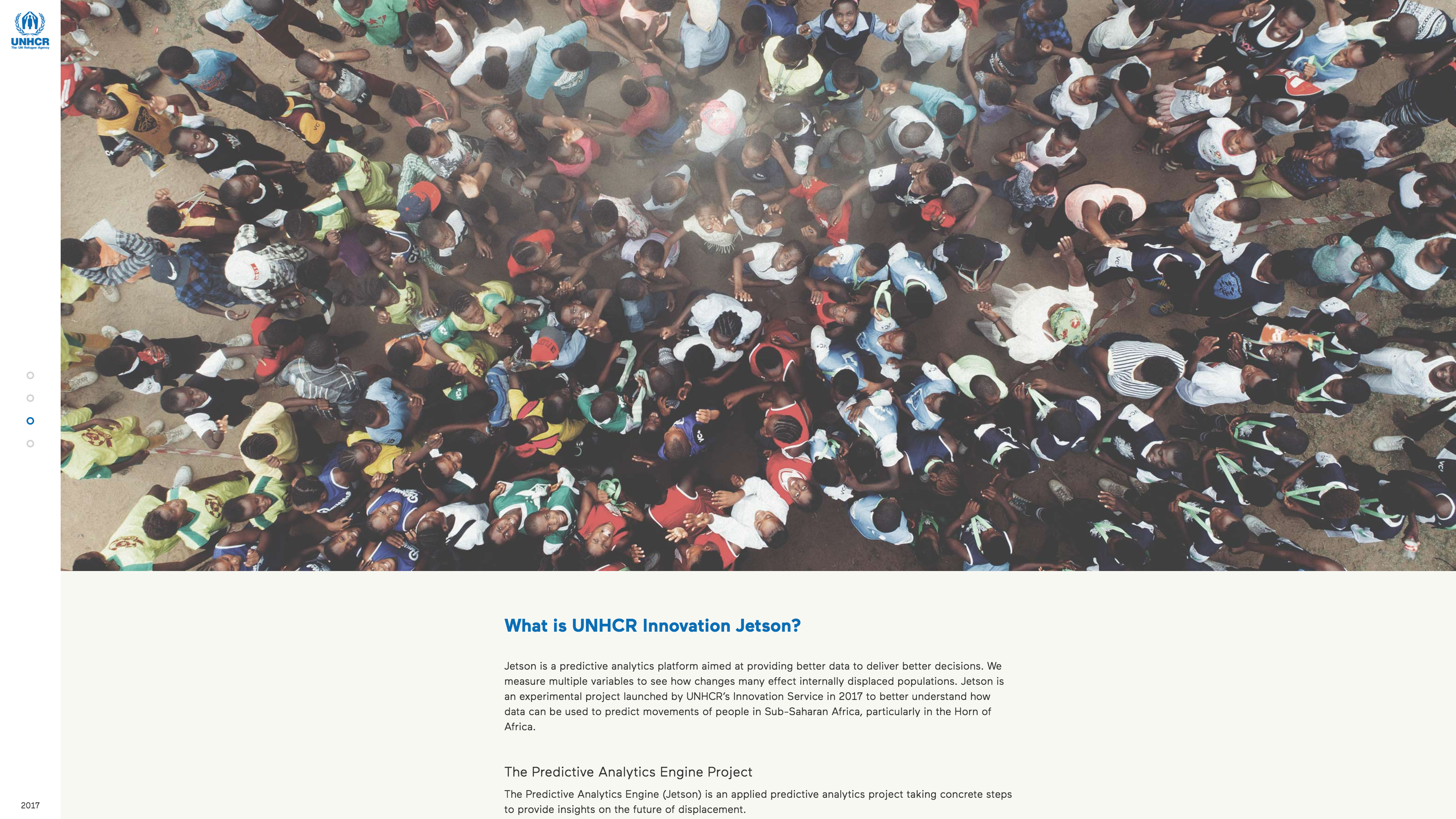
This catered to all user archetypes and allowed for quicker iterations on the form of the interface and has been in use ever since, with small aesthetic tweaks now and again.
Jetson Version 4.0.0 Component